food industry small business platform
Redesigned Homepage(s) & Iterated on Features

Our client was a food nonprofit innovation lab, whose goal was to help small food businesses grow. We focused on designing a platform with the end goal of connecting small food producers with industry experts to do product testing.
Timeline
My co-lead and I had 12 weeks to build a team of five designers, develop a rapport with the client, assess where they were in the design process, and iterate on different aspects of the platform that were all in various stages of development.
Background
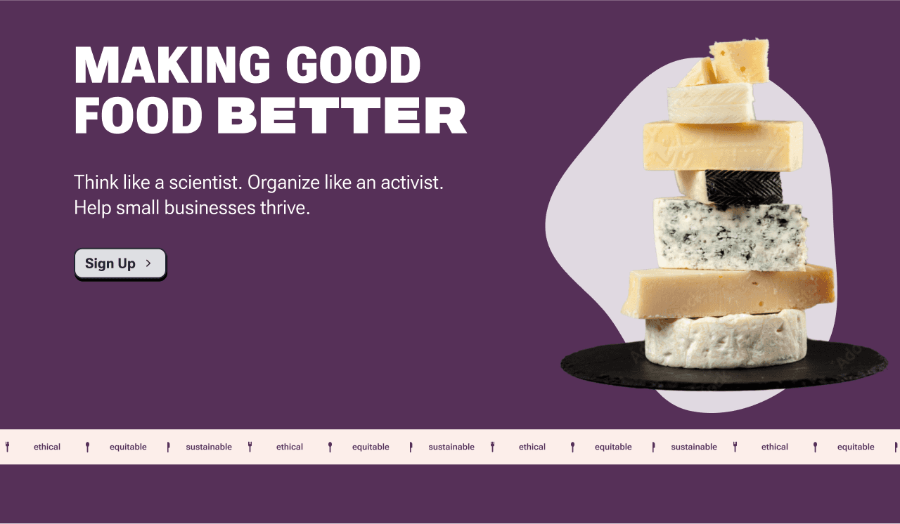
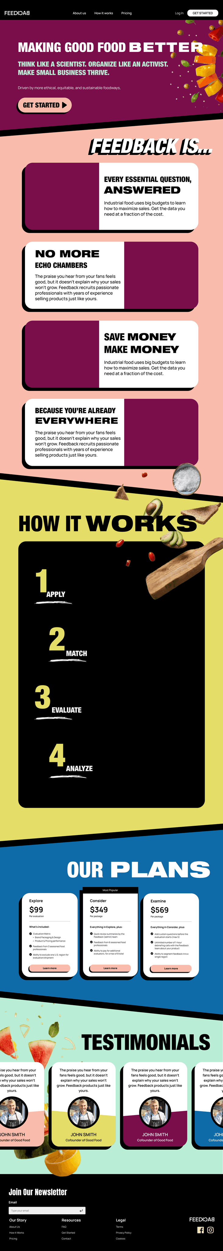
We took over this project in the middle of the design process, and set goals of redesigning the homepage, addressing accessibility issues, and streamlining the intake forms.
Challenges
After auditing the handoff materials, we started to build a design system and identified two key problems to solve: information overload and a multitude of accessibility issues.
We leaned on agile methodologies for our design process. Completing four design sprints, we were able to make progress on multiple facets of the project.
Research
We researched Neo Brutalist styles to better understand the aesthetic that the client wanted us to achieve and completed competitive analysis on product features.
Organization
We received a very large amount of copy to incorporate into the redesign. We reorganized the content and developed a strategy to best display all of the information.
Design
Leveraged agile development methodologies to redesign the homepage, iterated on a variety of intake forms, and created wireframes for the user dashboards.
Iteration
We met with the client once or twice a week and very rapidly iterated on our designs to refine our designs to meet their specifications.
Organize Content
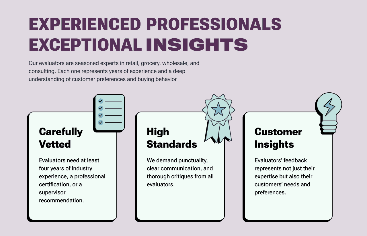
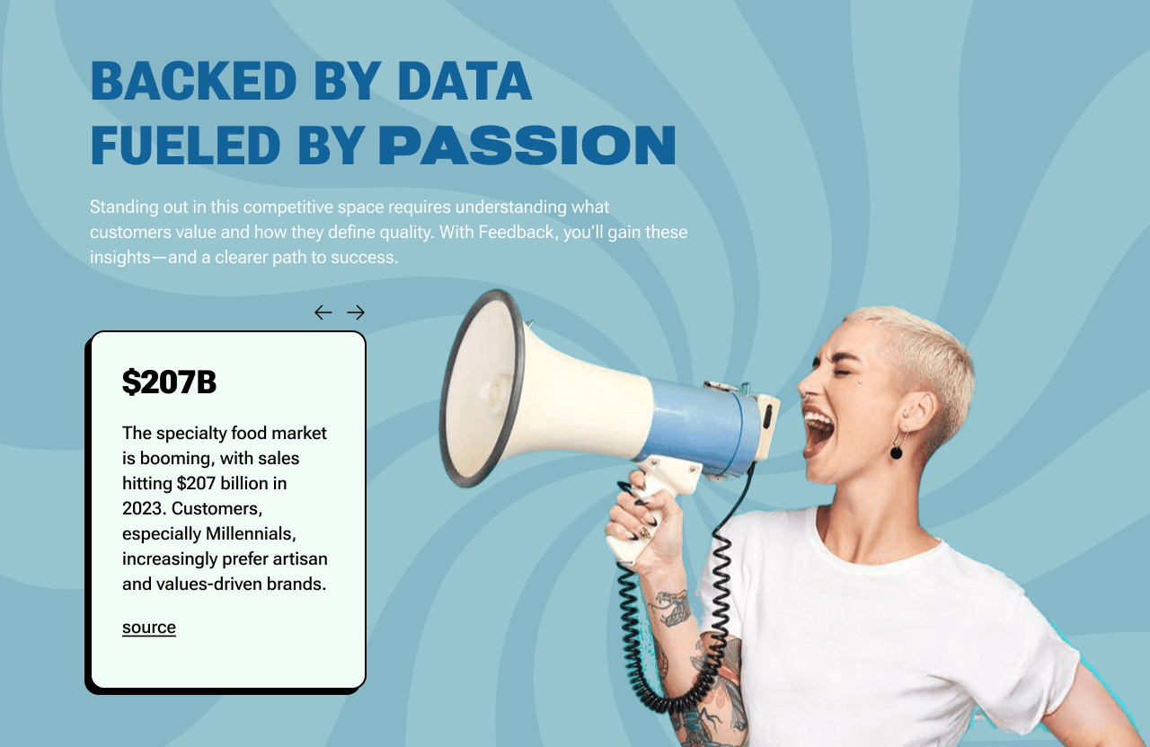
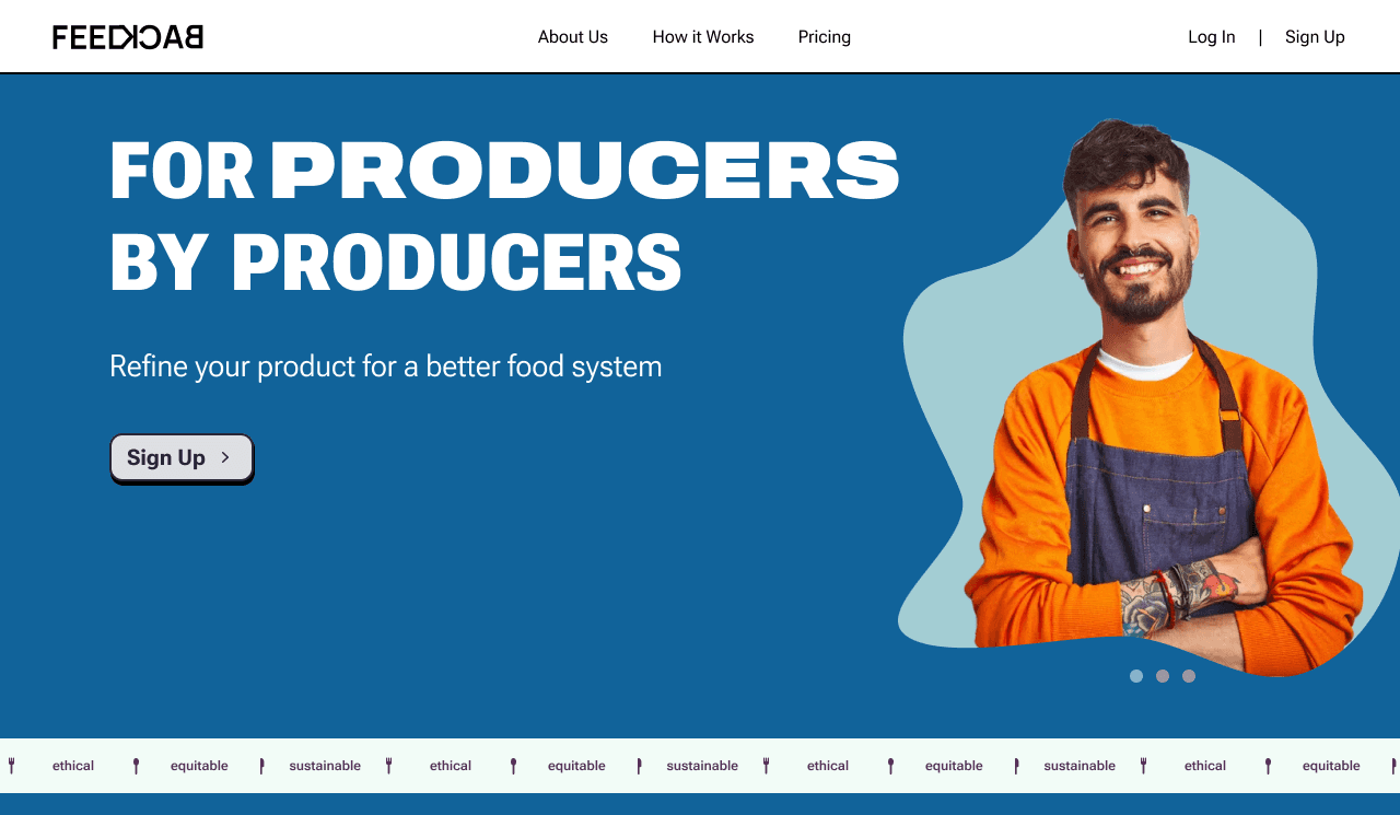
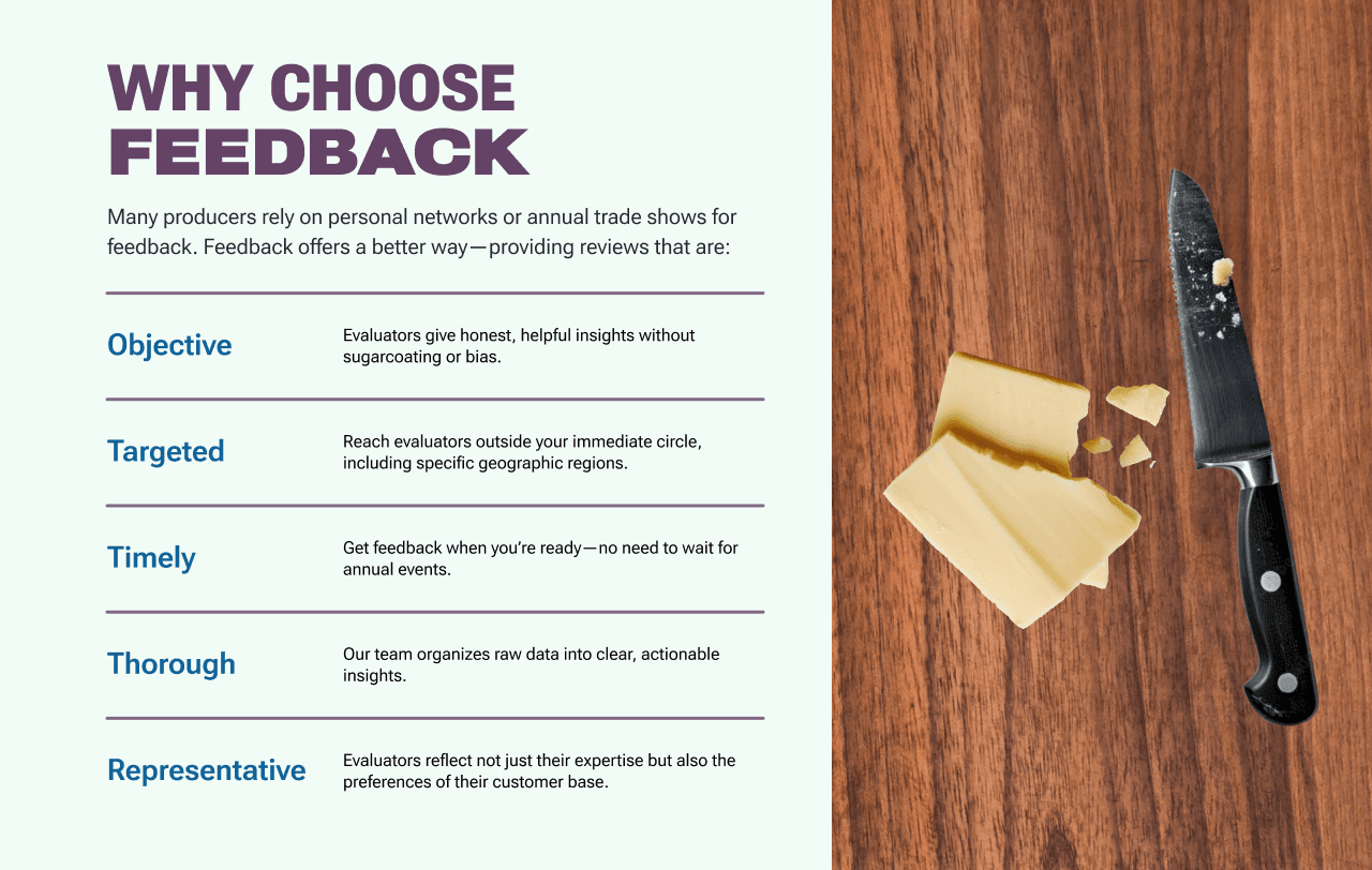
To declutter the homepage, we organized the content into three separate pages: a high-level homepage and a sub-home page for each side of the platform. We also rewrote the forms required to use the platform and reduced the number of pages from 6 to 3.
Accessibility Overhaul
We reduced the colors on the platform from 5 to 4 and tweaked the colors enough so that they would be WCAG compliant. We restructured the typography to be sized closer to industry best practices and reduced the amount of all caps and bold text throughout the site. Finally, we instituted a text hierarchy throughout the platform.
Dashboard Wireframes
We designed wireframes for the dashboards for each side of the platform.